Menu Close

Category: Mobile Development

Windows Phone Mango change, Listbox: How to detect compression(end of scroll) states ?

By MSDN

[Update: This is available after Beta2(Trial) build. Wait for RC/RTM builds]

If you’ve ever used a ListBox or ScrollViewer control and wanted to implement “infinite scrolling”, great news: in Mango you can easily detect both the end of scroll and compression states.

Infinite scrolling is a nice concept used when the data for a Listbox control is fetched from a server. Many web services let you fetch the data in chunks by specifying a starting location and number of records to retrieve in order to implement paging

A lot of web services are designed for a client to fetch ~40 items. Then, as the end user scrolls to the bottom of the list, client code detects that the end of the scrolling region has been reached (when the list compresses), and then fetches the next 40 odd items from the server.

Obviousy it isn’t a true infinite scrolling list – memory concerns can prop up, but it’ll feel infinite to most users if you implement a reasonable maximum.

How to detect the end of scrolling

On Windows Phone 7.0, the developer community came up with a bunch of hacks that worked in some situations, but we wanted to really offer this functionality in the platform for Mango and feel that it’s a much cleaner implementation as a result. Less hacking required!

So in Mango, throw away your old code – we’ve made this very easy and 100% reliable!

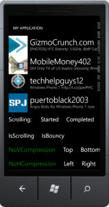
The attached sample shows all the various events that can be hooked to when scrolling on a WP7.1 application.

5810.image_5F00_4759BCBA[1]

We addressed this problem by introducing two new VisualStateGroups: HorizontalCompression andVerticalCompression.

The default style for the ScrollViewer does not include these new visual states – if you’re using them in your app, make sure to add a style to the app’s resources to expose these new VisualStateGroups.

Here’s the style:

    <Style TargetType="ScrollViewer"> 
            <Setter Property="VerticalScrollBarVisibility" Value="Auto"/> 
            <Setter Property="HorizontalScrollBarVisibility" Value="Auto"/> 
            <Setter Property="Background" Value="Transparent"/> 
            <Setter Property="Padding" Value="0"/> 
            <Setter Property="BorderThickness" Value="0"/> 
            <Setter Property="BorderBrush" Value="Transparent"/> 
            <Setter Property="Template"> 
                <Setter.Value> 
                    <ControlTemplate TargetType="ScrollViewer"> 
                        <Border BorderBrush="{TemplateBinding BorderBrush}" BorderThickness="{TemplateBindingBorderThickness}" 
Background="{TemplateBinding Background}"> 
                            <VisualStateManager.VisualStateGroups> 
                                <VisualStateGroup x:Name="ScrollStates"> 
                                    <VisualStateGroup.Transitions> 
                                        <VisualTransition GeneratedDuration="00:00:00.5"/> 
                                    </VisualStateGroup.Transitions> 
                                    <VisualState x:Name="Scrolling"> <Storyboard> 
                                            <DoubleAnimation Storyboard.TargetName="VerticalScrollBar" 
Storyboard.TargetProperty="Opacity" To="1" Duration="0"/> 
                                            <DoubleAnimation Storyboard.TargetName="HorizontalScrollBar" 
Storyboard.TargetProperty="Opacity" To="1" Duration="0"/> 
                                        </Storyboard> 
                                    </VisualState> 
                                    <VisualState x:Name="NotScrolling"> 
                                    </VisualState> 
                                </VisualStateGroup> 
                                <VisualStateGroup x:Name="VerticalCompression"> 
                                    <VisualState x:Name="NoVerticalCompression"/> 
                                    <VisualState x:Name="CompressionTop"/> 
                                    <VisualState x:Name="CompressionBottom"/> 
                                </VisualStateGroup> 
                                <VisualStateGroup x:Name="HorizontalCompression"> 
                                    <VisualState x:Name="NoHorizontalCompression"/> 
                                    <VisualState x:Name="CompressionLeft"/> 
                                    <VisualState x:Name="CompressionRight"/> 
                                </VisualStateGroup> 
                            </VisualStateManager.VisualStateGroups> 
                            <Grid Margin="{TemplateBinding Padding}"> 
                                <ScrollContentPresenter x:Name="ScrollContentPresenter" Content="{TemplateBinding Content}" 
ContentTemplate="{TemplateBinding ContentTemplate}"/> 
                                <ScrollBar x:Name="VerticalScrollBar" IsHitTestVisible="False" Height="Auto" Width="5" 
HorizontalAlignment="Right" VerticalAlignment="Stretch" Visibility="{TemplateBindingComputedVerticalScrollBarVisibility}" 
IsTabStop="False" Maximum="{TemplateBinding ScrollableHeight}" Minimum="0" Value="{TemplateBindingVerticalOffset}" 
Orientation="Vertical" ViewportSize="{TemplateBinding ViewportHeight}" /> 
                                <ScrollBar x:Name="HorizontalScrollBar" IsHitTestVisible="False" Width="Auto" Height="5" 
HorizontalAlignment="Stretch" VerticalAlignment="Bottom" Visibility="{TemplateBindingComputedHorizontalScrollBarVisibility}" 
IsTabStop="False" Maximum="{TemplateBinding ScrollableWidth}" Minimum="0" Value="{TemplateBindingHorizontalOffset}" 
Orientation="Horizontal" ViewportSize="{TemplateBinding ViewportWidth}" /> 
                            </Grid> 
                        </Border> 
                    </ControlTemplate> 
                </Setter.Value> 
            </Setter> 
        </Style>

If you compare this with the default style for ScrollViewer, you’ll see it’s really just the original PLUS the two additional VisualStateGroups.

As a reminder, the default style for each control can be found within the System.Windows.xaml file in the following location on a 64-bit machine: C:\Program Files (x86)\Microsoft SDKs\Windows Phone\v7.1\Design\System.Windows.xaml

So the two additional VisualStateGroups are:

                                <VisualStateGroup x:Name="VerticalCompression"> 
                                    <VisualState x:Name="NoVerticalCompression"/> 
                                    <VisualState x:Name="CompressionTop"/> 
                                    <VisualState x:Name="CompressionBottom"/> 
                                </VisualStateGroup> 
                                <VisualStateGroup x:Name="HorizontalCompression"> 
                                    <VisualState x:Name="NoHorizontalCompression"/> 
                                    <VisualState x:Name="CompressionLeft"/> 
                                    <VisualState x:Name="CompressionRight"/> 
                                </VisualStateGroup>

The names are self explanatory; “CompressionLeft” means that the compression animation is happening on the ScrollViewer content towards the left side of the viewport.

There are eight combinations coming out of this: top, bottom, left, right, top-left (45 degree angle compression), top-right, bottom-left and bottom-right.

After overriding the default style, you can listen to the CurrentStateChanging event on the corresponding VisualStateGroup element.

To get to the ScrollViewer’s visual state group you need following (building on top of the standard WP7 project template):

private void MainPage_Loaded(objectsender, RoutedEventArgs e) 
     { 
         if(!App.ViewModel.IsDataLoaded) 
         { 
             App.ViewModel.LoadData(); 
         } 

         if(alreadyHookedScrollEvents) 
             return; 

         alreadyHookedScrollEvents = true; 
         MainListBox.AddHandler(ListBox.ManipulationCompletedEvent, (EventHandler<ManipulationCompletedEventArgs>)LB_ManipulationCompleted, true); 
         sb = (ScrollBar)FindElementRecursive(MainListBox, typeof(ScrollBar)); 
         sv = (ScrollViewer)FindElementRecursive(MainListBox, typeof(ScrollViewer)); 

         if(sv != null) 
         { 
             // Visual States are always on the first child of the control template 
            FrameworkElement element = VisualTreeHelper.GetChild(sv, 0) asFrameworkElement; 
             if(element != null) 
             { 
                 VisualStateGroup group = FindVisualState(element, "ScrollStates"); 
                 if(group != null) 
                 { 
                     group.CurrentStateChanging += newEventHandler<VisualStateChangedEventArgs>(group_CurrentStateChanging); 
                 } 
                 VisualStateGroup vgroup = FindVisualState(element, "VerticalCompression"); 
                 VisualStateGroup hgroup = FindVisualState(element, "HorizontalCompression"); 
                 if(vgroup != null) 
                 { 
                     vgroup.CurrentStateChanging += newEventHandler<VisualStateChangedEventArgs>(vgroup_CurrentStateChanging); 
                 } 
                 if(hgroup != null) 
                 { 
                     hgroup.CurrentStateChanging += newEventHandler<VisualStateChangedEventArgs>(hgroup_CurrentStateChanging); 
                 } 
             } 
         }           

     }
  private UIElement FindElementRecursive(FrameworkElement parent, Type targetType) 
       { 
           int childCount = VisualTreeHelper.GetChildrenCount(parent); 
           UIElement returnElement = null; 
           if (childCount > 0) 
           { 
               for (int i = 0; i < childCount; i++) 
               { 
                   Object element = VisualTreeHelper.GetChild(parent, i); 
                   if (element.GetType() == targetType) 
                   { 
                       return element as UIElement; 
                   } 
                   else 
                   { 
                       returnElement = FindElementRecursive(VisualTreeHelper.GetChild(parent, i) as FrameworkElement, targetType); 
                   } 
               } 
           } 
           return returnElement; 
       }
       private VisualStateGroup FindVisualState(FrameworkElement element, string name) 
       { 
           if (element == null) 
               return null; 

           IList groups = VisualStateManager.GetVisualStateGroups(element); 
           foreach (VisualStateGroup group in groups) 
               if (group.Name == name) 
                   return group; 

           return null; 
       }

This will be pretty easy to follow along with if you download and run the sample app. Let us know if this helps you complete your scrolling-related scenarios.

Other important points

  • VerticalCompression and HorizontalCompression VisualStateGroups are available ONLY for 7.1
  • Both are available ONLY for ManipulationMode = System,
  • These groups are not part of the default style, but are available to use.
  • You can read about Control Syles and Templates in detail here

Thanks !

SLMPerf

Loading Data when Scrolls to the End of List in WP7

by danielvaughan.org

Most phone users are concerned about network usage. Network traffic comes at a premium, and a user’s perception of the quality of your app depends a lot on its responsiveness. When it comes to fetching data from a network service, it should be done in the most efficient manner possible. Making the user wait while your app downloads giant reams of data doesn’t cut it. It should, instead, be done in bite-sized chunks.

To make this easy for you, I have created a ScrollViewerMonitor which uses an attached property to monitor a ListBox and fetch data as the user needs it. It’s as simple as adding an attached property to a control which contains a ScrollViewer, such as a ListBox, as shown in the following example:

<ListBox ItemsSource="{Binding Items}"
         u:ScrollViewerMonitor.AtEndCommand="{Binding FetchMoreDataCommand}" />

Notice the AtEndCommand. That’s an attached property that allows you to specify a command to be executed when the user scrolls to the end of the list. Easy huh! I’ll explain in a moment how this is accomplished, but first some background.

Background

For almost the last year, I’ve been building infrastructure for WP7 development. A lot has been going into the book I am writing, and even more is making its way into the upcoming Calcium for Windows Phone. I am pretty much at bursting point; wanting to get this stuff out there.

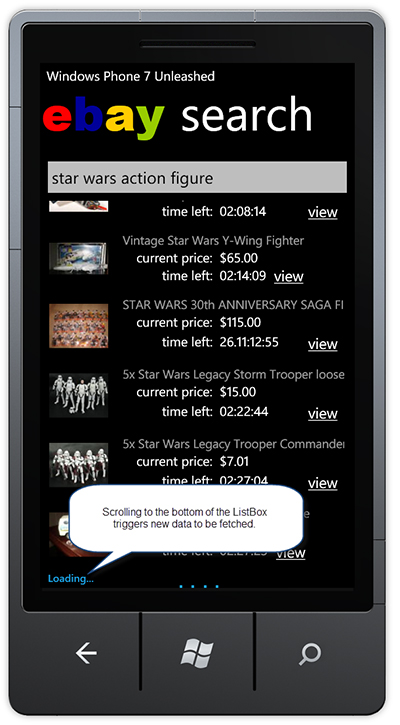
The chapter of Windows Phone 7 Unleashed, which discusses this code, demonstrates an Ebay search app that makes use of the Ebay OData feed (see Figure 1). It’s simple, yet shows off some really nice techniques for handling asynchronous network calls.

EbayApp

Figure 1: The Ebay Seach app from Windows Phone 7 Unleashed.


The Ebay app isn’t in the downloadable code for this post. But there is a simpler app that displays a list of numbers instead.

The way the ScrollViewerMonitor works is by retrieving the first child ScrollViewer control from its target (a ListBox in this case). It then listens to its VerticalOffset property for changes. When a change occurs, and the ScrollableHeight of the scrollViewer is the same as the VerticalOffset, the AtEndCommand is executed.


public class ScrollViewerMonitor
{
    public static DependencyProperty AtEndCommandProperty
        = DependencyProperty.RegisterAttached(
            "AtEndCommand", typeof(ICommand),
            typeof(ScrollViewerMonitor),
            new PropertyMetadata(OnAtEndCommandChanged));

    public static ICommand GetAtEndCommand(DependencyObject obj)
    {
        return (ICommand)obj.GetValue(AtEndCommandProperty);
    }

    public static void SetAtEndCommand(DependencyObject obj, ICommand value)
    {
        obj.SetValue(AtEndCommandProperty, value);
    }

    public static void OnAtEndCommandChanged(
        DependencyObject d, DependencyPropertyChangedEventArgs e)
    {
        FrameworkElement element = (FrameworkElement)d;
        if (element != null)
        {
            element.Loaded -= element_Loaded;
            element.Loaded += element_Loaded;
        }
    }

    static void element_Loaded(object sender, RoutedEventArgs e)
    {
        FrameworkElement element = (FrameworkElement)sender;
        element.Loaded -= element_Loaded;
        ScrollViewer scrollViewer = FindChildOfType<ScrollViewer>(element);
        if (scrollViewer == null)
        {
            throw new InvalidOperationException("ScrollViewer not found.");
        }

        var listener = new DependencyPropertyListener();
        listener.Changed
            += delegate
            {
                bool atBottom = scrollViewer.VerticalOffset
                                    >= scrollViewer.ScrollableHeight;

                if (atBottom)
                {
                    var atEnd = GetAtEndCommand(element);
                    if (atEnd != null)
                    {
                        atEnd.Execute(null);
                    }                    
                }
            };
        Binding binding = new Binding("VerticalOffset") { Source = scrollViewer };
        listener.Attach(scrollViewer, binding);
    }

    static T FindChildOfType<T>(DependencyObject root) where T : class
    {
        var queue = new Queue<DependencyObject>();
        queue.Enqueue(root);

        while (queue.Count > 0)
        {
            DependencyObject current = queue.Dequeue();
            for (int i = VisualTreeHelper.GetChildrenCount(current) - 1; 0 <= i; i--)
            {
                var child = VisualTreeHelper.GetChild(current, i);
                var typedChild = child as T;
                if (typedChild != null)
                {
                    return typedChild;
                }
                queue.Enqueue(child);
            }
        }
        return null;
    }
}


Of course there is a little hocus pocus that goes on behind the scenes. The VerticalOffset property is a dependency property, and to monitor it for changes I’ve borrowed some of Pete Blois‘s code, which allows us to track any dependency property for changes. This class is called BindingListener and is in the downloadable sample code.

Sample Code

The ViewModel for the MainPage contains a FetchMoreDataCommand. When executed, this command sets a Busy flag, and waits a little while, then adds some more items to the ObservableCollection that the ListBox in the view is data-bound too.

Snippet

public class MainPageViewModel : INotifyPropertyChanged
{
    public MainPageViewModel()
    {
        AddMoreItems();

        fetchMoreDataCommand = new DelegateCommand(
            obj =>
                {
                    if (busy)
                    {
                        return;
                    }
                    Busy = true;
                    ThreadPool.QueueUserWorkItem(
                        delegate
                        {
                            /* This is just to demonstrate a slow operation. */
                            Thread.Sleep(3000);
                            /* We invoke back to the UI thread. 
                                * Ordinarily this would be done 
                                * by the Calcium infrastructure automatically. */
                            Deployment.Current.Dispatcher.BeginInvoke(
                                delegate
                                {
                                    AddMoreItems();
                                    Busy = false;
                                });
                        });

            });
    }

    void AddMoreItems()
    {
        int start = items.Count;
        int end = start + 10;
        for (int i = start; i < end; i++)
        {
            items.Add("Item " + i);
        }
    }

    readonly DelegateCommand fetchMoreDataCommand;

    public ICommand FetchMoreDataCommand
    {
        get
        {
            return fetchMoreDataCommand;
        }
    }

    readonly ObservableCollection<string> items = new ObservableCollection<string>();

    public ObservableCollection<string> Items
    {
        get
        {
            return items;
        }
    }

    bool busy;

    public bool Busy
    {
        get
        {
            return busy;
        }
        set
        {
            if (busy == value)
            {
                return;
            }
            busy = value;
            OnPropertyChanged(new PropertyChangedEventArgs("Busy"));
        }
    }

    public event PropertyChangedEventHandler PropertyChanged;

    protected virtual void OnPropertyChanged(PropertyChangedEventArgs e)
    {
        var tempEvent = PropertyChanged;
        if (tempEvent != null)
        {
            tempEvent(this, e);
        }
    }
}


There’s a lot more infrastructure provided with the book code. But I tried hard to slim everything down for this post. The MainPage.xaml contains a Grid with a ProgressBar, whose visbility depends on the Busy property of the viewmodel.

Snippet

<Grid x:Name="ContentPanel" Grid.Row="1" Margin="12,0,12,0">
    <Grid.RowDefinitions>
        <RowDefinition Height="*" />
        <RowDefinition Height="Auto" />
    </Grid.RowDefinitions>
    <ListBox ItemsSource="{Binding Items}"
                u:ScrollViewerMonitor.AtEndCommand="{Binding FetchMoreDataCommand}">
        <ListBox.ItemTemplate>
            <DataTemplate>
                <StackPanel Orientation="Horizontal">
                    <Image Source="Images/WindowsPhoneExpertsLogo.jpg" 
                            Margin="10" />
                    <TextBlock Text="{Binding}" 
                                Style="{StaticResource PhoneTextTitle2Style}"/>                            
                </StackPanel>
            </DataTemplate>
        </ListBox.ItemTemplate>
    </ListBox>
    <Grid Grid.Row="1"
            Visibility="{Binding Busy, 
                Converter={StaticResource BooleanToVisibilityConverter}}">
        <Grid.RowDefinitions>
            <RowDefinition />
            <RowDefinition />
        </Grid.RowDefinitions>
        <TextBlock Text="Loading..." 
                    Style="{StaticResource LoadingStyle}"/>
        <ProgressBar IsIndeterminate="{Binding Busy}"
                        VerticalAlignment="Bottom"
                        Grid.Row="1" />
    </Grid>
</Grid>


You may be wondering why there is a databinding for ProgressBar’s IsIndeterminate property. This is for performance reasons, as when indeterminate the ProgressBar is notorious for consuming CPU. Check out Jeff Wilcox’s blog for a solution.

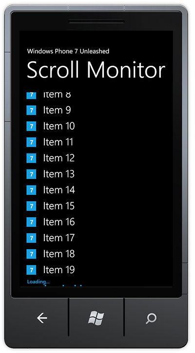
Now, when the user scrolls to the bottom of the list, the FetchMoreDataCommand is executed, providing an opportunity to call some network service asynchronously (see Figure 2).

ScrollMonitor

Figure 2: Loading message is displayed when the user scrolls to the end of the list.


I hope you enjoyed this post, and that you find the attached code useful.

If you are interested in up-to-the-minute WP7 info, check out the Windows Phone Experts group on LinkedIn.


DanielVaughan.ScrollViewerMonitor.zip (126.56 kb)

WP7 ContextMenu: answers to popular questions

by WindowsPhoneGeek

In the last few days we received lots of questions about how to use ContextMenu in WP7. In this mini tutorial we will give our answers to some of them.

NOTE: Before we begin let me first mention that ContextMenu is a part of the Silverlight for Windows Phone 7 toolkit. You can also take a look at our WP7 ContextMenu in depth | Part1: key concepts and API article for reference.

Question 1: Can I add Context Menu to DataTemplate ?

Question 2: I have ListBox with ContextMenu. How can I highlight the ListBox SelectedItem?

Question 3: I have ListBox with ContextMenu. How to get  a reference to the ListBox tapped item from the ContextMenu Click handler?

[…]

WP7 ContextMenu in depth | Part1: key concepts and API

I am starting a “WP7 ContextMenu in depth” series of articles in which I am going to talk about the Windows Phone 7 ContextMenu  in details. In this article “Part1: key concepts and API”  I will talk about the key properties, events and the main features of the Windows Phone 7 Context Menu control in details.

One of the new components in the Silverlight Toolkit is ContextMenu. Basically when the user taps and holds on any item the context menu appears. It is used in areas like for example the application list, where if you tap and hold an application you get the option to pin it to the start menu, uninstall, etc.

To begin using ContextMenu first  add a reference to  the Microsoft.Phone.Controls.Toolkit.dll  assembly which is installed with the toolkit and you can find it in :
C:\Program Files (x86)\Microsoft SDKs\Windows Phone\v7.0\Toolkit\Nov10\Bin\Microsoft.Phone.Controls.Toolkit.dll.

You will also need to add the “toolkit” prefix declaration. Make sure that your page declaration includes the “toolkit” namespace:

xmlns:toolkit="clr-namespace:Microsoft.Phone.Controls;assembly=Microsoft.Phone.Controls.Toolkit"

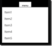
38menu2_2[1] 

The sample code should looks like:

<toolkit:ContextMenuService.ContextMenu>
    <toolkit:ContextMenu>
        <toolkit:MenuItem Header="Item1"/>
        <toolkit:MenuItem Header="Item2"/>
        <toolkit:MenuItem Header="Item3"/>
        <toolkit:MenuItem Header="Item4"/>
        <toolkit:MenuItem Header="Item5"/>
    </toolkit:ContextMenu>
</toolkit:ContextMenuService.ContextMenu>

ContextMenuService

ContextMenuService provides the system implementation for displaying a ContextMenu. Basically it consists of a “ContextMenu” attached dependency property.

  • ContextMenu

Identifies the ContextMenu attached property.

       Example:

<toolkit:ContextMenuService.ContextMenu>
 <toolkit:ContextMenu>
 ...
 <toolkit:ContextMenu>
 <toolkit:ContextMenuService.ContextMenu>


ContextMenu

Key Properties

  • IsOpen

IsOpen is a dependency property of type bool. It gets or sets a value indicating whether the ContextMenu is visible.

  • IsZoomEnabled

IsZoomEnabled is a dependency property of type bool.  It gets or sets a value indicating whether the background will zoom out when the ContextMenu is open.

       Example:

<toolkit:ContextMenu VerticalOffset="100.0" IsZoomEnabled="True"  x:Name="menu">
</toolkit:ContextMenu >
  • ItemContainerStyle

ItemContainerStyle is a dependency property of type Style .It gets or sets the Style that is applied to the container element generated for each item.

       Example:

                   <toolkit:ContextMenu   x:Name="databoundMenu"> 
                        <toolkit:ContextMenu.ItemContainerStyle> 
                            <Style TargetType="toolkit:MenuItem"> 
                              <Setter Property="Background" Value="YellowGreen" /> 
                              <Setter Property="Margin" Value="5" /> 
                            </Style> 
                        </toolkit:ContextMenu.ItemContainerStyle> 
                    </toolkit:ContextMenu>
  • VerticalOffset

VerticalOffset is a dependency property of type double. It gets or sets the vertical distance between the target origin and the popup alignment point.

       Example:

                   <toolkit:ContextMenu VerticalOffset="100.0" IsZoomEnabled="True"  x:Name="menu">
                   </toolkit:ContextMenu >

Events

  • Closed

Closed occurs when a particular instance of a ContextMenu closes.

       Example:

       this.menu.Closed += new RoutedEventHandler(menu_Closed);
       void menu_Closed(object sender, RoutedEventArgs e) 
        { //add some content here}
  • Opened

Opened occurs when a particular instance of a ContextMenu opens.

       Example:

       this.menu.Opened += new RoutedEventHandler(menu_Opened);
       void menu_Opened(object sender, RoutedEventArgs e) 
        { //add some content here}


MenuItem

Key Properties

  • Command

Command is a dependency property of type ICommand. It gets or sets the command associated with the menu item.

  • CommandParameter

CommandParameter is a dependency property of type object.  It gets or sets the parameter to pass to the Command property of a MenuItem.

  • Header

Header  is a dependency property of type  object.  It gets or sets the item that labels the control. The default value is null.

  • HeaderTemplate

HeaderTemplate is a dependency property of type DataTemplate. It gets or sets a data template that is used to display the contents of the control’s header.

  • ItemContainerStyle

ItemContainerStyle is a dependency property of type Style .It gets or sets the Style that is applied to the container element generated for each item.

Events

  • Click

Click occurs when a MenuItem is clicked.

       Example:

       <toolkit:MenuItem Header="Add"  Click="MenuItem_Click"/>
       private void MenuItem_Click(object sender, RoutedEventArgs e) 
        {//add some content here}


Populating ContextMenu with Items

Here is an example of how to use this control in the easiest way using MenuItems:

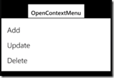
<Button Content="OpenContextMenu" Height="100" Width="270">
    <toolkit:ContextMenuService.ContextMenu>
        <toolkit:ContextMenu>
            <toolkit:MenuItem Header="Add"  Click="MenuItem_Click"/>
            <toolkit:MenuItem Header="Update"  Click="MenuItem_Click"/>
            <toolkit:MenuItem Header="Delete"  Click="MenuItem_Click"/>
        </toolkit:ContextMenu>
    </toolkit:ContextMenuService.ContextMenu>
</Button>
private void MenuItem_Click(object sender, RoutedEventArgs e)
{
    MenuItem menuItem = (MenuItem)sender;
    MessageBox.Show("You chose to  " + menuItem.Header.ToString(),"Result",MessageBoxButton.OK);
}

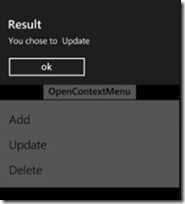
The result can be seen on the following screen shots:


In this example when the user tap and hold the “OpenContextMenu” button as a result a context menu appears from where you can select from three options. After you choose an item a MessageBox appears with information about the selected operation.

DataBinding ContextMenu

Here is an example of how to populate ContextMenu using simple data binding. We will also add some ItemContainerStyle in order to change the background color of the items:

 
<Button Content="DataBinding" Height="100" Width="270">
    <toolkit:ContextMenuService.ContextMenu>
        <toolkit:ContextMenu   x:Name="databoundMenu">
            <toolkit:ContextMenu.ItemContainerStyle>
                <Style TargetType="toolkit:MenuItem">
                  <Setter Property="Background" Value="YellowGreen" />
                  <Setter Property="Margin" Value="5" />
                </Style>
            </toolkit:ContextMenu.ItemContainerStyle>
        </toolkit:ContextMenu>
    </toolkit:ContextMenuService.ContextMenu>
</Button>
List<string> menuItems = new List<string>() {"Copy", "Paste", "Cut" };
this.databoundMenu.ItemsSource = menuItems;

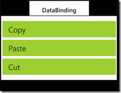
The result can be seen on the following screen shots:
   

That was all about the key properties, events and the main features of the Windows Phone 7 ContextMenu in depth.

I hope that the article was helpful. You can find the full source code here: